Getting a clear picture of where your money goes can unlock sustainable financial wellness. By harnessing the power of visual aids, individuals and organizations can transform raw numbers into actionable insights, driving smarter choices and fostering long-term stability.
Understanding the Power of Visualizing Spending
Raw spreadsheets and endless columns of numbers often leave us overwhelmed and uncertain. Charts and graphs, by contrast, simplify the story behind the data, making patterns instantly recognizable. By turning numbers into complex financial data in clear visuals, you gain the confidence to make informed decisions rather than guessing your way through budgets.
When you visualize spending, you free your mind from sifting through tedious details. Colors, shapes, and patterns work together to highlight where your funds go, revealing not just totals but the narrative of your financial habits.
- Faster comprehension of your overall financial picture.
- Enables you to spot spending trends and budget leaks at a glance.
- Simplified comparisons across categories and time periods.
- Clear communication with partners, families, or teams.
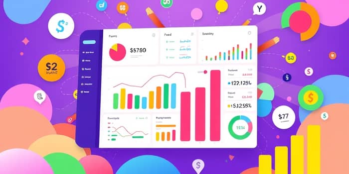
Essential Chart Types for Spending Visualization
Different chart styles suit different goals. Selecting the right format ensures your data tells the most impactful story.
- Bar/Column Charts: Ideal for side-by-side category comparisons, such as dining out versus groceries over several months.
- Line Graphs: Perfect for tracking spending trends over time, letting you spot seasonal fluctuations or anomalies.
- Pie Charts: Offer a quick glance at percentage breakdowns, showing which categories dominate your budget.
- Stacked Column Charts: Reveal how different expenses accumulate to a total, useful for layered insights on utilities, rent, and more.
- Waterfall Charts: Visualize the step-by-step impact of transactions, illustrating how each expense influences your ending balance.
- Bubble Charts: Provide a multidimensional view of your spending patterns, mapping amount, frequency, and category in one graphic.
Design Best Practices for Effective Charts
Clarity and accessibility are paramount. Simple, well-labeled charts ensure viewers focus on insights rather than deciphering the graphic itself.
Choosing colorblind-safe colors for every category helps maintain clarity for all audiences. Use warm tones to highlight increases and cool tones for decreases, maintaining consistency across charts.
Avoid clutter by limiting gridlines and data points to the essentials. Highlight key figures with bold labels or contrasting colors, guiding the eye to the most critical information.
Practical Examples and Templates
Templates and real-world examples make it easier to get started. Whether you’re tracking household expenses or presenting departmental budgets, having a ready-made layout speeds up the process.
Interpreting Your Charts to Inform Decisions
Creating a chart is only half the journey. Learning to read each visualization empowers you to act on insights. Identify spikes in discretionary spending, notice months with unusually low expenses, and adjust your plans accordingly.
Start monitoring progress toward savings and goals month by month. Set benchmarks on your line graph, compare actual expenses against targets on your bar chart, and celebrate small wins when pie slices shrink in dominant categories.
Tools and Technologies to Bring Charts to Life
Numerous tools exist to help you craft stunning visuals. Spreadsheet software like Excel and Google Sheets offers built-in chart features, while budgeting apps auto-generate graphs from your transaction data.
Developers can integrate libraries such as Syncfusion Flutter Charts for seamless mobile dashboards. For professional presentations, PowerPoint templates and custom infographic platforms add polish to every slide.
Conclusion: Transform Your Finances Through Visualization
Empowering your financial journey starts with clarity. By experimenting with different chart types and adhering to design best practices, you turn abstract numbers into a compelling narrative of your spending habits.
With engaging, colorful visuals that drive insights, you can take control, communicate effectively with stakeholders, and make confident decisions. Start experimenting today—your financial future awaits.
References
- https://www.financealliance.io/financial-charts-and-graphs/
- https://www.moneyfront.in/blogs/creative-ways-to-visualize-and-analyze-your-monthly-budget/
- https://www.syncfusion.com/blogs/post/flutter-chart-income-expenditure
- https://www.tableau.com/visualization/data-visualization-examples
- https://www.slideteam.net/blog/top-10-spending-chart-templates-with-examples-and-samples
- https://blog.hubspot.com/marketing/types-of-graphs-for-data-visualization
- https://aliabdaal.com/youtube/the-ultimate-guide-to-youtube/