Tracking your net worth is about more than just numbers; it’s a journey of self-discovery, empowerment, and strategic planning. By leveraging color-coded visual summaries, you can transform raw data into an inspiring narrative of financial progress.
Understanding Net Worth Tracking
Net worth tracking involves calculating the difference between assets and liabilities. Assets include cash, investments, real estate, retirement accounts, business equity, crypto, and vehicles, while liabilities cover debts, loans, and credit balances. The core formula is simple: Net Worth = Assets – Liabilities.
Regular monitoring provides a clear snapshot of financial health and highlights the impact of life events—such as a mortgage payoff, a new property purchase, or market volatility—on your long-term trajectory.
Essential Tools and Platforms
Choosing the right platform can enhance your tracking process. Leading solutions offer a mix of automation, customization, and powerful visuals. Below is a comparison of top contenders:
For do-it-yourself enthusiasts, free spreadsheet templates like Johnny Africa’s Net Worth sheet or Vertex42’s calculators can provide a quick start, with automatic price updates via functions like GOOGLEFINANCE().
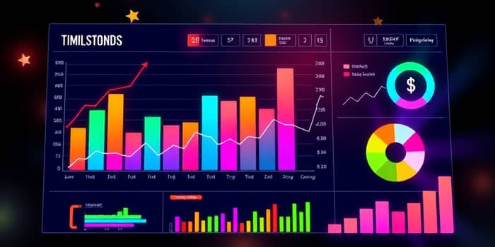
Visualization Strategies and Color Coding
Effective visualization turns numbers into insights. Use charts and colors thoughtfully to make your data pop and communicate trends at a glance.
- Bar Charts: Compare asset or liability categories over months or years.
- Line Graphs: Track net worth evolution and highlight upward or downward trends.
- Pie Charts: Display percentage breakdowns of asset allocation.
- Radar Charts: Visualize performance across multiple financial KPIs.
Color-coded visual summaries enhance interpretation: green for asset growth, red for liability increases, and yellow for milestone achievements. Custom badges or shading can mark significant financial events, such as debt payoff dates or investment windfalls.
Automating Updates and Special Features
Automation reduces manual work and keeps your dashboard current. Harness the power of built-in functions and platform integrations to receive real-time net worth updates with minimal effort.
Key automation and special features include:
- Automatic price refresh for stocks, ETFs, and crypto using live feeds.
- Annotations for major events—car purchases, home renovations, or lump-sum investments—directly on your timeline.
- Comparison lines showing contributions versus total net worth growth.
- Scenario modeling with Monte Carlo simulations for probability-based projections.
Creating Your Personalized Dashboard
Building a dashboard that resonates with your goals requires a clear structure and intuitive design.
Begin by defining your key categories: liquid cash, investments, real estate, retirement funds, debts, and alternative assets. Assign each category a distinct color and chart type to foster instant recognition.
Next, set milestones and goals. Whether you aim for a $100,000 net worth or early retirement, embedding target lines or colored alerts keeps motivation high. Platforms like ProjectionLab provide sliders and sliders for quick scenario adjustments, while Tiller Money empowers you to craft bespoke Excel charts with custom rules.
Best Practices for Long-Term Success
Consistency and clarity are vital for sustained engagement. Follow these best practices to ensure your dashboard remains a trusted companion on your financial journey:
- Update regularly: Schedule weekly or monthly review sessions to import new data and validate figures.
- Use clear labels: Ensure your charts have descriptive titles and legends for easy interpretation.
- Maintain simplicity: Avoid clutter by limiting the number of simultaneous charts and focusing on core metrics.
- Review milestones: Celebrate achievements by highlighting changes visually, reinforcing positive habits.
Data-driven financial decisions become second nature when you trust your dashboard. The visual feedback loop keeps you accountable and informed.
Real-Life Examples and Case Study
Consider Jane, who used a Tiller Money spreadsheet to monitor her net worth after a career change. By color-coding her assets and liabilities, she quickly realized her real estate equity was growing faster than she expected, prompting her to rebalance toward stocks for diversification.
Similarly, Mark leveraged ProjectionLab’s Monte Carlo feature to simulate early retirement at 55. The probability projections, displayed in vibrant gradients, gave him the confidence to adjust his savings rate and test different market return scenarios.
Conclusion: Embracing Your Financial Journey
Tracking net worth evolution with color-coded visual summaries transforms abstract numbers into a compelling story of progress and potential. By adopting the right tools, automating updates, and applying best practices, you gain actionable insights and clear motivation to stay on course.
Your financial dashboard is more than a report; it’s a lens through which you see growth, setbacks, and opportunities. Embrace the power of visual storytelling to guide every decision and celebrate every milestone on your path to financial freedom.
References
- https://moneywise.com/investing/net-worth/net-worth-trackers
- https://ofdollarsanddata.com/net-worth-tracker/
- https://projectionlab.com/net-worth
- https://www.harness.co/harness-tools/net-worth-tracking/
- https://www.youtube.com/watch?v=Xv0u5fACEEo
- https://www.financealliance.io/financial-charts-and-graphs/
- https://tiller.com/6-best-free-net-worth-spreadsheets/